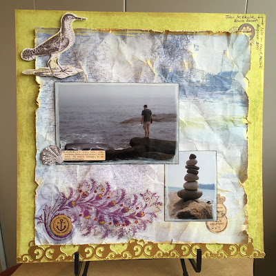
It’s Winter Camp time over on Scrappin’ Peeps, and today I’m
hosting a Mardi Gras inspired color challenge.
According to neworleans.com (“the official New Orleans travel site”) the colors of Mardi Gras were chosen
in 1872 and each given a symbolic meaning: green for faith, gold for power, and purple for justice.
For
my LO I chose to forego the traditional deep purple and green, opting instead
for a lime green and a lighter, bluer purple. I pulled some old K & Company collections
out of my stash and found this nautical paper that reminded me of a trip we
took to an island off the coast of Maine.
Since the island was somewhat rustic and natural, I wanted a bit of a
worn look, so I distressed the edges with a Prima distressing tool, crumpled
the paper to wrinkle it up, and then instead of inking the edges, I used some
Inka Gold Metallic Rub to add shimmer. I
also lightly rubbed it over the top of the page to add distressing and bring
out the wrinkles more.
 To
make my photos stand out, I edged each one with Picket Fence Distress Stain and
then inked the edges in black. From
there I simply added a K & Company border and ephemera, a wood veneer that I also colored with the Metallic Rub, and a bit of journaling in
purple ink to complete the look. You could easily substitute metallic acrylic paint for the Inka Gold rub.
Materials
Used: paper (K & Company Happy Trails
and Que Sera Sera), embellishments (K
& Company Que Sera Sera, wood veneer by Studio Calico),
adhesive (ATG, Scotch Vellum tape, Forever in Time foam dots, Art Glitter),
inks and rubs (Distress Stain in Picket
Fence, Ranger Archival Ink in Black,
and Inka Gold Metallic Rub in Gold),
pen (Bic)


No comments:
Post a Comment