Monday, February 15, 2016

Altering Printed Photos


It's the final day of Winter Camp 2016 over at Scrappin' Peeps.  What a fun week(+) of activities it's been!

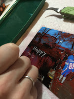
Image altering is pretty prevalent in this day and age of Photoshop and other editing software, but you can also alter photos after they've been printed.  Today I'm going to show you one way to do that, by scratching some of the emulsion off the print.

Photographic emulsion is the coating on the photo paper that actually creates your image when the photo is processed.  When dry, it is fairly hard and won't rub off or scratch easily.  When wet and soft, however, it can be damaged.  We are going to take advantage of this property.


What you'll need:                                                                  

  1. a shallow tray of warm water (I use an old food container lid)
  2. a printed photo (professional and home printed both work)
  3. some scratching tools (I used a paper piercer, some tweezers, and a dry embossing tool.)
  4. paper towels

Step 1.  Immerse your photo in the warm water for 30-60 seconds.  It may start to curl up and expose parts of the photo to air.  Just gently push it back down.  Don't hold it under water, or the part under your finger may not get enough exposure to the water to soften, or you may accidentally scratch an area you don't want scratched.


Step 2.  Remove the photo, shaking excess water off, and lay face up on a paper towel.  (Do not dry off the front of the photo.  Any water remaining on the surface will help the emulsion stay softer longer.)

Step 3.  Choose a tool and begin "drawing" on the surface of the photo, using enough pressure to remove the emulsion layer but not enough to go right through the backing paper.  Note: the sharper your tool, the easier it will be to scratch off the emulsion.  If the emulsion still feels kind of hard and you're having difficulty removing it, soak the photo for another 30 seconds and try again.  Also, if you've been working for a long period of time, you may need to stop and resoak periodically because the emulsion will harden as it dries.  Different tools will produce different results, mainly in the width of the line you are able to scratch.  My paper piercer can make a very fine line, while scraping the end of my tweezers across the paper makes a wider line.

dry embossing tool
paper piercer

tweezers


Step 4.  Gently wipe the emulsion debris off the photo with a paper towel.  If it dries onto the photo, it will be hard to remove without damaging your image.


Step 5.  Set the photo aside to dry.


Now that you know the basics, you can start experimenting.  Try different tools for scratching, like pens, Silhouette or Cricut tools, even sandpaper.  I keep an art journal just for trying out new techniques.  Sometimes I love the results, sometimes, not, but I always learn something.  Here are some examples from my journal of when I played around with this technique in the past:


This is a picture of my kids on one of those airplane amusement park rides.  I scratched away at the background to make it look like the plane was flying on it's own, while still leaving some of the background color showing.  The smaller picture is a close up.


Here I did the same thing, but then colored over it with watercolor pencils.
This one is my favorite.  It's my boys playing on the beach when we went to visit Grandma.  The sandcastle, seashells, sun, and seagulls were all scratched in.  Then I used a "Good Times" rub-on in the corner and matted it on summery patterned paper.

Friday, February 12, 2016

One Ink, Two Ink, Red Ink, Blue Ink – A Guide to Ink Pads


Today at Scrappin' Peeps Winter Camp, I'm all about the inks!

When I first started out the only ink pad I knew about was the black felt one in my dad’s office that he used to stamp the return address on his business envelopes.  Little did I know how complicated the world of ink could be, and it’s only gotten more so as the years go on.  (For this reason, I’m going to focus only on ink pads today, and save spray inks, stains, reinkers, India ink, alcohol ink, etc. for another day.)  Here is a little tutorial on what the different kinds of ink pads are, and what are the best options for the different projects you might work on.


There are two basic kinds of ink: dye and pigment.  Let’s compare and contrast, shall we?

Dye Ink                                                             Pigment Ink
Translucent                                                        opaque
Dries quickly on matte paper                            dries slower on matte paper (good for heat embossing)
Dries fairly quickly on slick surfaces               may need to be heat set in order to dry on slick surfaces
Soaks into paper                                                sits on top of paper
Usually has a felt or linen pad                           usually has a foam pad
Most will fade over time                                    much more colorfast
Best on lighter backgrounds                               works well for both light and dark backgrounds

In the Dye Ink family you will find different subsets that work well for different applications:

1.       Waterbased dye inks – these are one of the most common inks available and the easiest to find.  They can be used for stamping as long you don’t plan on coloring the image with another water-based ink like markers.  Colored pencils work great, though.  These are not the best choice for scrapbooking because they usually fade over time.

2.       Waterproof dye inks – these can be used for coloring with markers and other water-based colorants without smearing.  Many people like to use either Ranger’s Archival Ink or Tsukineko’s Memento Ink to stamp images they plan to color with markers, especially alcohol markers like Copic and Spectrum Noir.  These inks can be more fade resistant than the regular dye inks – check the label to be sure.  These may need to be cleaned with a permanent/solvent ink cleaner rather than just water.

3.       Distress Inks – these inks have special properties that keep them wet longer than most dye inks, so you can blend them and use them for heat embossing.  The color also floats when sprayed with water, so you can create interesting effects.  These are great for inking the edges of paper with a makeup sponge or blending tool since they don’t dry as fast and you can get a better blended look with them.  I personally don’t like them for stamping because the image looks mottled, like the ink didn’t evenly cover the stamp.  That might be a look you’re going for though, if you’re doing distressed or shabby chic looks.  These are fade resistant, so more scrapbooking friendly.

This example of stamping done with Whispers (a waterproof dye ink) vs. Distress Inks shows the mottling Distress Inks give.

Here are a few other kinds of inks you might come across:

Chalk ink – these are usually a type of pigment ink that dries with a chalky, matte finish.  These are nice for inking directly on canvas and other textured surfaces.

Solvent Inks – (Staz-On)  these are non-water based and are usually waterproof, fade proof, and permanent.  They work great on non-porous surfaces such as glass, metal, and plastic.  DO NOT use solvent inks with alcohol markers (Copic, Spectrum Noir, etc.).  The alcohol will dissolve the solvent and may ruin your marker, as well as smear the image.

Hybrid Inks – these combine properties of both dye and pigment inks, so they fall somewhere in the middle of the transparent to opaque range.  They dry quickly, like a dye ink, but can be used on many surfaces like a pigment ink.  My Favorite Things is one manufacturer that makes hybrid inks.  I haven’t tried them out myself yet, but I hear from a lot of stampers that they love them.

Specialty Inks – watermark, resist, and embossing inks fall into this category.  Some, like the Ranger Inkssentials Watermark Resist, do all three jobs.  It leaves a watermark impression on dark papers, can be used as a resist for waterbased inks, and dries slowly and has a stickiness that make it great for heat embossing.

And now, a quick-reference guide to what ink to use for certain projects:

·         Stamping sentiments or images that won’t be colored – pretty much any ink can be used for this.  For dark backgrounds use a pigment ink.

·         Stamping for coloring – Any ink will work for colored pencils, but for markers choose a waterproof dye ink.  Do NOT use solvent ink (like Staz-On) with alcohol markers.

·         Edging papers and photos for scrapbooking – choose fade resistant inks like waterproof dye inks, Distress Inks, or pigment inks.  Check the label if you’re not sure.

·         Backgrounds – Distress Inks are great for making backgrounds since they blend well together and react to water in a unique way.  Check out some Tim Holtz videos on YouTube to see how versatile these inks can be.

·         Heat Embossing – There are specialty embossing inks that work great for this.  They dry clear to show off your embossing powder’s true color.  Pigment and Distress Inks also work well for this, and you can create some cool effects by using a colored ink under your colored powder, or colored ink with a clear embossing powder for a varnish effect.

·         Non-porous surfaces (glossy paper, glass, metal, etc.) – solvent inks work best on these, but some pigments and waterproof inks can also be used if you heat set them with a heat gun or blow dryer.

·         Kids’ crafts – any ink pad that says WASHABLE on it!  ;)


* Note: Some of this info comes from my own use of different inks, but much of it was gleaned from the internet on sites like RangerInk.com and Craftsy.com.


Tuesday, February 9, 2016

Mardi Gras Color Challenge

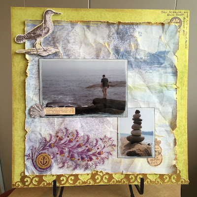
It’s Winter Camp time over on Scrappin’ Peeps, and today I’m hosting a Mardi Gras inspired color challenge.  According to neworleans.com (“the official New Orleans travel site”) the colors of Mardi Gras were chosen in 1872 and each given a symbolic meaning: green for faith, gold for power, and purple for justice.

For my LO I chose to forego the traditional deep purple and green, opting instead for a lime green and a lighter, bluer purple.  I pulled some old K & Company collections out of my stash and found this nautical paper that reminded me of a trip we took to an island off the coast of Maine.  Since the island was somewhat rustic and natural, I wanted a bit of a worn look, so I distressed the edges with a Prima distressing tool, crumpled the paper to wrinkle it up, and then instead of inking the edges, I used some Inka Gold Metallic Rub to add shimmer.  I also lightly rubbed it over the top of the page to add distressing and bring out the wrinkles more.


To make my photos stand out, I edged each one with Picket Fence Distress Stain and then inked the edges in black.  From there I simply added a K & Company border and ephemera, a wood veneer that I also colored with the Metallic Rub, and a bit of journaling in purple ink to complete the look.  You could easily substitute metallic acrylic paint for the Inka Gold rub.


Materials Used: paper (K & Company Happy Trails and Que Sera Sera), embellishments (K & Company Que Sera Sera, wood veneer by Studio Calico), adhesive (ATG, Scotch Vellum tape, Forever in Time foam dots, Art Glitter), inks and rubs (Distress Stain in Picket Fence, Ranger Archival Ink in Black, and Inka Gold Metallic Rub in Gold), pen (Bic)