Showing posts with label Show and Tell. Show all posts

Tuesday, February 3, 2015

Hello Awesome

The Wednesday Challenge at the Simon Says Stamp Challenge Blog is Anything Goes this week, and one of the companies they are focusing on is Lil' Inker Designs.  It just so happens that I recently ordered some dies and stamps from Lil' Inker, so I decided to play along.


I used three Lil' Inker products on this card: the Stitched Mats: Rounded Rectangles die, the Awesome Word die, and the little "Awesome" word stamp from their Notebook Doodle Stamps.  I cut the rectangle out and stamped the "awesome" background with embossing ink.  Since the stamp had some black ink left on it, it came out grey in some places.  I also stamped the "hello" with a Hampton Art stamp.  I cut out 6 "Awesome" words from glitter cardstock and stacked them to create depth, offsetting the top layer for a shadow effect.  A glitter cardstock background and some fun sequins finished it off.

This was my first experience with Lil' Inker products and I have to say I'm pretty impressed.  (Please note -- I have no affiliation with the company and don't get anything for reviewing their product.  I'm just a regular consumer who happens to like what she got.)  I have dies from a few manufacturers that I have to shim with multiple layers of paper or run through the machine multiple times to get a clean cut.  My Lil' Inker dies cut cleanly and perfectly on the first run without any shimming, even when cutting glittered cardstock.  The stamps also made a clean impression, with every detail coming out crisp.

I'm super busy trying to get my house ready to sell because we're moving to another state, so creative time is at an absolute minimum for me right now.  Taking this challenge and trying out my new goodies was a really fun way to get some art into my day.  I always feel inspired when I have something new to play with, and doing a challenge is a great way to focus on a specific design element.  This all makes for a much quicker creative process for me.  Usually I sit around for hours trying lots of different ideas and product combinations.  This time I knew what stamps and dies I wanted to use, I already had the glitter cardstock out from another project I'd just finished, and instead of going, "Hmm... what little embellishments should I add?" I decided on sequins and didn't even look at anything else.  I love how quickly it all came together, and now that I've had a little creative fix, I can face sorting through another kid's closet without losing my mind.  :)

Happy Crafting, everybody!

Materials Used: cardstock: DCWV and Crafter's Companion, dies: Lil' Inker Designs, stamps: Lil' Inker Designs and Hampton Art, sequins: Studio Calico, Adhesive: ATG and Art Glitter, ink: Ranger, other: card blank

Sunday, September 7, 2014

Pretty Packages

It amazes me how the simplest packaging can add so much to the experience of receiving something.  I recently ordered some stamps and dies from CASual Fridays and they came packaged like this:


Just a strip of cute tissue paper around the middle, tied with a piece of twine, but it made me smile.  It made me feel like they cared enough about me as a customer to put in the extra effort to package my order in a cute way.

I had a similiar experience a few months ago when my mother-in-law got me a subscription to Somerset Studio for my birthday.  (Yes, I won the MIL lottery.  She's awesome!)  One day I found an envelope in my mailbox with this inside:


What a beautiful way to announce my gift subscription!  I felt like I was really going to get a high quality product from this company if the gift announcement was packaged so nicely.

Even an extra little message added to a card envelope can make someone's day.  This was on the card my sister sent me for my birthday this year:


That's one way to ensure the envelope will be saved!  :)

Sometimes as crafters we get so used to what we make that we don't realize the impact our creations can have.  This pillow box was so simple to make, but the response to it was great. 


I put some chocolates and a gift card in these to give to my son's teachers at the end of the year.  He has some learning difficulties, so his IEP team had been working with him for a few years, and he was now moving on to middle school.  I wanted to let them know how much we appreciated what they did for him and how far he had come with their help.  I put a little note inside that said "Thank you for helping him SOAR!"

When I dropped these off at his school, the office staff kept commenting on the packaging and how cute it was.  They couldn't believe I made it.  I was surprised by the reaction because it was so easy to make!  I'm so used to what I make, and to seeing the amazing creations of my fellow crafters, that I forgot how special what we do actually is.

So next time you're looking at a website, a magazine, or even a friend's work and think, "Oh, I wish I was that good!" remember:  YOU ARE!  To the people who receive your handmade cards or albums or even just pretty packaging on something, the effort you put into it makes them feel extra special.  And that's worth more than anything.

Happy Crafting!


Wednesday, August 20, 2014

Heartfelt Creations Flowers

I've had some Heartfelt Creations stamps and dies for awhile now.  I've used the Sweet Juliet dies to make flowers, but this is the first time I've used the stamps and dies together.  I got out the Vintage Floret sets and went to work on a lay out for a challenge on Scrappin' Peeps.  (The challenge was to use a 6-Word Memoir on your lay out.)  It was a lot of work making all the flowers, especially since I haven't found a good method for combining the stamps and die cuts yet.  I need to invest some time in watching videos on ways to do it.  In the end, the effort was so worth it, though.  I absolutely LOVE my lay out!  I think I'm going to get a 12x12 frame for it and hang it up somewhere.  I mean, who wouldn't want to see my cute babies every day?  :)


Everything on this lay out is paper and ink, which is kind of amazing to me.  With all the scrappy goodies out there to embellish with, I sometimes forget how much you can do with just paper!

Materials Used: paper: Heartfelt Creations (Countryside Evening Collection); ink: Tim Holtz Distress (Pumice Stone, Walnut Stain, Broken China), Lindy's Stamp Gang Moonshadow Mist (Buccaneer Bay Blue), Wink of Stella Brush (Clear); stamps and dies: Heartfelt Creations (flowers = Vintage Florets, leaves = Sweet Juliet and Delicate Asters); flower-shaping tools: McGill; pen: Faber-Castell Pitt Artist Pen (black); adhesive: ATG and Art Glitter

Saturday, August 2, 2014

Camp Iwannascrap 2014 Water Wonders: Modeling Paste


Hi Campers!  Today we're going to play with modeling paste!  Yippee!

Modeling paste is an acrylic polymer that you can use to create amazing texture on your lay outs and cards.  It can be mixed with acrylic paint to color it before applying, and once dry it can be painted over with acrylics, water colors, inks... all kinds of stuff.  So it's a very versatile medium to play with.

Modeling paste is also called molding paste by Golden Artist Colors.  When I looked up what the difference was, I found out there really isn't any.  According to Golden's website, Mr. Golden just carried "molding paste" over from a similiar product, but it's basically the same thing.  (Apparently he also used it to fill a dent in his car bumper... oh, those creative types!  lol)

I have another video tutorial for you, but I'll warn you that it's a little on the long side (7 minutes).  The first half is the modeling paste technique and the second half is an insight into my crazy process.  Here you go:


And here is the finished LO:


As I mentioned in the video, I did this for the Everything's Coming Up Roses Challenge at Scrappin' Peeps.  The pink roses were made using a tutorial found at Stacy Cohen's blog.

Materials used: cardstock: American Crafts, patterned paper: DCWV (Blossoms & Butterflies), flowers: Recollections, bling: Queen & Co, sequins: Studio Calico, molding paste: Golden, adhesive: Beacon and Multicraft Imports

Photo taken by Studio Mark Emile in NH


Wednesday, July 30, 2014

Camp Iwannascrap 2014 Water Wonders: Gel Medium

Hi there!  Today I have another video tutorial for you; this one on how to use gel medium to create a resist effect.

I mention in the video that I'm using a "soft gel," so I thought I would explain a little bit about what that means.  There are a wide variety of gel mediums out there, and they are used for different purposes, such as glazing, decoupage, adding texture, and extending paints.  "Soft" gel is thinner than some of the other gels, so it spreads on in a super thin layer and doesn't create peaks as much as other gels do.  It's great for resist techniques.

When I first ventured into using art mediums I bought a sample box that came with six different Golden gel mediums in it.  I haven't tried them all yet, but I'm having fun just playing around and seeing what each can do.  I bought mine at Michael's using a 40% off coupon (yahoo!), but they are also available from Dick Blick Art Materials, which also has an excellent description of the different types of gel mediums.

Now, on with the show!  :)


I used acrylic paint for this project, but you could use pretty much any colorant, such as watercolors, spray ink, ink pads, markers, stains, etc.  Here is the finished card I made using the background:


Directions:

  1. Cut a 4" x 5.5" piece of blue patterned paper and cover the front of a card blank with it.
  2. Cut a 3.5" x 4.75" piece of tan Subway Art patterned paper.
  3. Use gel medium to isolate just a few words.  Let dry.
  4. Paint over entire paper with acrylic paint to tone down the other words.  It doesn't have to completely cover the words -- if a hint of the typography shows through the paint it will add visual interest to your card.
  5. Wipe paint off gel medium to expose the isolated words.  Let paint dry over the rest of the paper.
  6. Wrap ribbon around lower part of the paper and secure to the back with tape.
  7. Attach this painted background sheet to the front of the card.
  8. Attach flower embellishment with bling.
Materials Used: card blank: Recollections, patterned paper: Teresa Collins, gel medium: Golden, acrylic paint: Plaid, flowers: Recollections (white) and Heartfelt Creations (the blue flower was die cut and stamped on HC paper using HC die and stamp set), ink: Tim Holtz, flower center: Prima, other: ribbon


Sunday, July 27, 2014

Camp Iwannascrap 2014 Water Wonders: Gelatos and Gesso

Hi Campers!  I hope you enjoyed the first week of Camp Iwannascrap!  To start off Week 2 in the Water Wonders Unit I have a tutorial that uses Gesso and Faber Castell Gelatos in a reverse masking technique.


As promised, here is the card I created using the background I made in the video:


Directions:
  1. Attach a 3.5" x 5" piece of the background to a 4" x 5.5" white card blank.
  2. Color wood veneer with yellow pigment ink.  Attach to top right corner.
  3. Attach turtle embellishment with foam dots.  Mine is a die cut I made with an Ellentina metal die.
  4. Add enamel dots to create water bubbles.
  5. Add "It's Your Birthday!" sentiment to the inside of the card.
Materials Used: card blank: Recollections, cardstock: American Crafts, gesso: Folk Art, colorants: Faber Castell gelatos (blueberry,metallic mint, and cotton candy) and Scrappy Cat pigment ink (yellow), wood veneer banner and Enamel Dew Drop Stickers: Freckled Fawn, metal die: Ellentina, other: patterned paper


Wednesday, July 23, 2014

Camp Iwannascrap 2014 Water Wonders: Watercolor Brush Stamps

Watercolor is all the rage in the crafting world right now, and I have to say I'm all for it.  I love the look!  But what if you're not that good with a paint brush, don't like to get messy, or don't have room to store even more craft supplies than you already hoard, ahem, have.  Enter the watercolor brush stroke stamps!  There are a lot of companies making these, and for digi or hybrid scrappers there are lots of options out there, too. Just Google watercolor stamps.

The stamp set I have is from the Pink Paisley Color Wash collection.  It includes three brush strokes and a number of words and symbols to combine with them.  I really like the layered effect you can get with these.


image from pinkpaisley.com

All you need is the stamps, ink, paper, and embellies and you have the makings of a quick, easy, and cute card.

 = 

Directions:
1. Layer a 3.75' x 5.25" piece of patterned paper on a 4' x 5.5" white card blank.  If desired, ink the edges first.
2.  On a 3.5" x 5" piece of white cardstock, stamp three brush strokes in different colors, then use black ink to stamp "Happy" over each of them.  Ink the edges and attach the cardstock to the front of the card.
3.  Add a 1.75" flower to the bottom right corner.  
4.  Punch a 1" circle from patterned paper with sentiment on it, or punch a 1" circle of cardstock and add your own sentiment.  A 6x6 sheet of tag paper works well for this:


5. Attach circle to the middle of the flower and ring the edges with tiny rhinestones.  Voila!  An easy peasy card in 10 minutes or less.

Materials used: card blank: Recollections, Patterned Paper: Pebbles, Inc., stamps: Pink Paisley, rhinestones: Queen & Co., ink: Stephanie Barnard for Color Box (Strawberry, Sky, and Celery) and Memento (Tuxedo Black), other: cardstock & flower


Tuesday, July 22, 2014

Scrappin' Peeps Camp Iwannascrap Blog Hop

Welcome to the Scrappin' Peeps summer camp blog hop!  I am so excited to join this group of talented women in sharing projects with you.  You should have arrived here from Robyn's blog, but if you didn't that's ok!  Here's the complete list of blogs: 

Kraze of MJ  
My Scrap Bliss 

Cozie Nook Homestead
Terrapin Creek Design Studio


This post was inspired by a challenge over at A Cutt Above.  I just love the Splish Splash cut file in their Etsy store!  I have a gazillion pictures of us in the pool, so this was the perfect way to get some of them scrapped.


First I cut the entire file on a 12 x 12 sheet of cardstock.  Before removing it from the Silhouette mat, I pried up the edges near the splash cuts and placed photos underneath, centering them the way I wanted them cut.  I then removed the cardstock and ran the photos through the machine, cutting only the splashes.  I wanted to add two more photos, but I didn't want the splashes to look exactly the same, so I copied the cut file in Silhouette Studio, flipped it, and enlarged the splashes before making two more photo cuts.


Once the photos were ready, I used the original cardstock as a stencil, taping a couple sheets of copier paper over parts of the page to isolate the "Splish Splash" title.  I sprayed the title with two different inks to add a little extra dimension to the letters:


From there I cut the "Family Fun" out of patterned paper and attached it with foam squares to pop it up off the page.  Finally, I sprinkled glass baubles and bling around the page to mimic water droplets.  I thought about adding some journaling, but then decided to just let the pictures tell the story.  On the back of the page I included the date the photos were taken. 

I hope this has inspired you to create, too!  And in that spirit, who would like a little bling?!  All you have to do is:

  • Leave a comment on all four blogs in the Camp Iwannascrap blog hop.
  • Create a new scrapbook layout or card that has something to do with water (please no back linking -- the goal is to get you creating).
  • Leave a link to your creation in the comments on this post by August 22, 2014. 
A winner will be randomly drawn from all who submit.

** UPDATE: Congratulations, islandscrapper!  You are the winner of this fun and fabulous bling set!  Thanks so much for playing along!!

We could be yours!


Thanks for stopping by!  

** Materials used: cardstock: American Crafts, die cutting file: A Cutt Above the Rest (Splish Splash), patterned paper: K & Company (Citronella), spray ink: Ranger -- Dylusions (London Blue) and Perfect Pearls Mists (Turquoise), bling: the Robin's Nest Dew Drops (Water) and Queen & Co. bubbles and rhinestones

Friday, March 21, 2014

Don't Throw Away Those Pilly PJs Yet!

Hi everyone!  I'm back!  Sorry for the long absence.  Some family matters took precedence over many other things in my life, like this blog, but I am ready to roll and get back into it.

In a wishful effort to bring on Spring, I have started to clean out my kids' closets and sort the clothes they've outgrown.  Some go into a bag for donation, some are put away on the off chance we decide to add one more to our family, and then there are those that are too worn, ripped, or stained to donate.  These are the clothes that I think of as creative possibilities.  Before they go into the trash, I see what I can salvage off them.  Sometimes it's just a button or snap, sometimes a pocket, sometimes a big square of the fabric.  But my favorites are the kids' t-shirts or PJs that have a design on the front.  Some of these shirts are even embroidered.

For this LO I took one of my daughter's old PJ tops and cut the front embroidered design out.  Then I cut off the ruffle that was at the hem of the shirt and handsewed it around what was now my title.


Add some glittered cardstock, lots of flowers, butterflies, and bling, and I had a super girly LO for my super girly girl!  

So next time you're getting ready to throw out an old shirt or a ripped pair of jeans, take a look to see what you can salvage.  The back pockets of jeans make great journaling or memoriabilia pockets; zippers, ruffles, and other trims can be wound into unique flowers or used as borders; and even just using a swatch of fabric in your background can add some great texture to a LO.  You'll have a unique embellishment that also has some sentimental value.

Have you ever used old clothing on a scrapbook or art project?  I'd love to hear about it!

Thursday, May 23, 2013

The Party Doesn't Stop Here

Wow, as the end of the school year approaches, things sure do get crazy busy!  I've been running all over the place getting kids to track practices, dance class, getting ready for recitals and school programs, volunteering for all kinds of classroom activities, and going to end-of-the-year teas, luncheons, and parties.  Whew!  Unfortunately, the blog is being a little neglected right now.  Sorry about that!

Here is another idea for upcycling some things you might have around the house to make easy and meaningful scrapbook pages:
*****

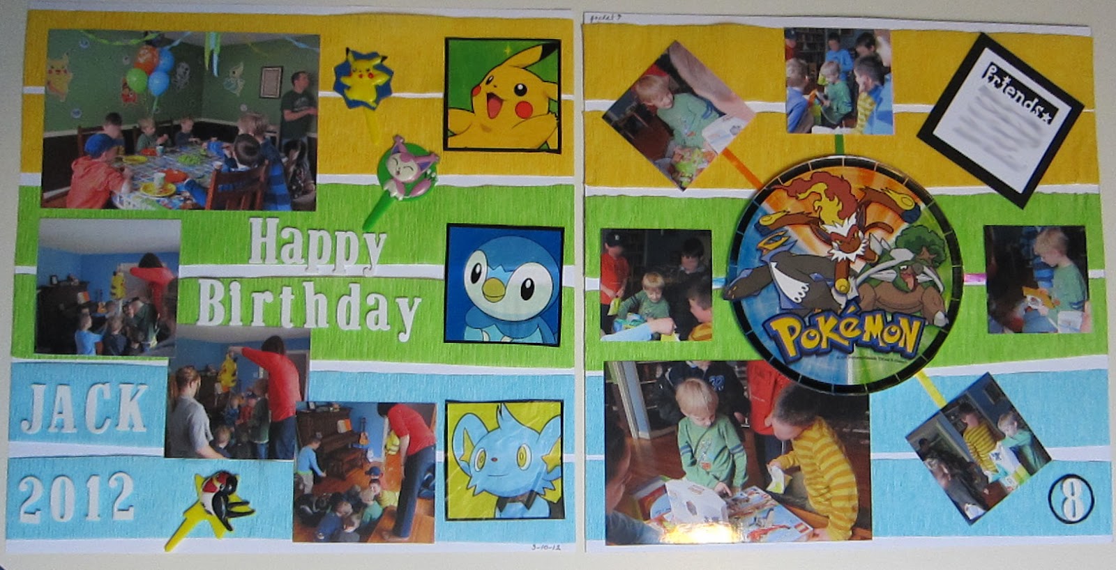
I've had a lot of fun doing birthday parties for my kids, and a lot of that fun is in decorating for them.  But once the party's over, should the decorations just be relegated to the trash can?  Of course not!  Having two boys just 19 months apart means I've been able to use some of the decorations for both of them, but I also decided to use some for a scrapbook layout.  This LO is almost entirely made of upcycled party decorations!


The background stripes are made from the streamers that hung from the ceiling, the square Pokemon pictures were cut from the plastic table cloth, the "flags" are cupcake picks, the round Pokemon decoration on the right page is cut from one of the paper plates, and the spokes coming from it to the pictures are ribbons from the balloons and pinata.  The only scrapbook supplies I used were 3 pieces of 12x12 cardstock (I glued two together on the right to create a pocket for his birthday cards and a copy of the invitation), the letter stickers, and the "friends" punch and paper scraps I used to make the journal tag in the upper right corner.

Tuesday, April 23, 2013

Not Your Traditional Wedding Layout

I've been working on scrapping some of the old photos I have stashed away and came across a box that I had sorted wedding photos into.  There were about 10 weddings in there.  That's a lot of white.

I did do some traditional LOs:


But I also decided to do some non-traditional ones as well.  I've been trying to use up some of my stash and had come across some K & Company Edamame collection papers, flowers, and chipboard letters.  It just seemed right for the personalities of two of my friends:


They are both really fun people (as evidenced by the renaissance theme of their wedding), and I actually knew them separately first.  Then I moved away from town for a few years, and when I came back I ran into them together.  It turns out that they met when one (a nursing student when I met him) volunteered to help out in an aquatic therapy class at the town pool.  The other was in the class as part of her physical therapy for MS.  Let me tell you, there was not a dry eye in the place when he carried her back up the aisle as husband and wife!  It has to be the sweetest, most romantic real-life story I know.

I like how the LO turned out.  I just don't think traditional black and white, or even white and a pastel color, would have felt right for this couple.  The same can be said for the next LO:


This was an outdoor wedding in a backyard, and it was so casual that the wedding guests were instructed not to wear anything dressy -- just dress for a BBQ.  I've had this piece of paper from Melody Ross for awhile, unsure of how to use it with that large, flocked butterfly.  I think it worked pretty well here.  A non-traditional LO for a non-traditional wedding.  All I had to add was the photos, title, and journaling.

Sometimes traditional styles just don't fit the personality of the people or the atmosphere of the event you're scrapping about.  Have you done a LO that used colors that aren't normally associated with the event you were scrapping?  Tell me about it in the comments, and don't forget to add a link to it.  I'd love see how you changed things up!

And check back soon -- I'll be posting a tutorial on how to make a mini flip album to go on your scrapbook page (like the one on the first LO in this post).

Monday, April 8, 2013

Old Photos, New Life

Do you remember those old photo albums that had a plastic sheet that peeled up off a page covered with adhesive?  You just peeled up the plastic, stuck your photos on the page, and then laid the plastic back down over them?  Seemed pretty darn cool back in the 70's & 80's, but now we know all about acid and lignon and all those other things that wreak havoc on our mementos.  Not to mention the fact that after a few years the glue dried out and your photos started to fall out of the albums.

Well, I have a whole stack of those puppies, ranging from ones my mom put together when I was a wee one all the way through my college "scrapbooks."  ("Scrapbooks" as in the old fashioned meaning -- just some photos and ticket stubs with a note of explanation.  Not the current meaning which involves oodles of specialized product that I can't seem to get enough of.)  So I'm slowly working to transfer those memories to archival safe albums, and of course I can't just stick them in a new-and-improved plastic sleeve and be done with it.  Oh no.  I must create!

So here is one of those creations, which I made in response to a sketch challenge from the new scrapbooking challenge blog, Paper Lovers Studio.


The photos and journaling are just as they were in the old album.  They're just on a cuter and safer background now.  I wanted to keep my original journaling for a couple of reasons.  One is that it's a little insight into the Me that existed 20 years ago, and the other is because it preserves what my handwriting used to look like.  I have Essential Tremers, so as the years have progressed, so have my shakes, and my handwriting isn't so nice anymore.

I'm also doing the Dash Your Stash challenge from the Club Creating Keepsakes forum and have been on a spending freeze since December (in anticipation of going crazy at the upcoming Creating Keepsakes Convention vendor fair), so everything used here is from my stash.  The cardstock and Dear Lizzy badge are from American Crafts, patterned paper and crocheted flowers from Recollections, journaling spot from K & Company, felt flowers and buttons from Michael's, paper flowers from Studio 18, and letter stickers and metal clip from Making Memories.